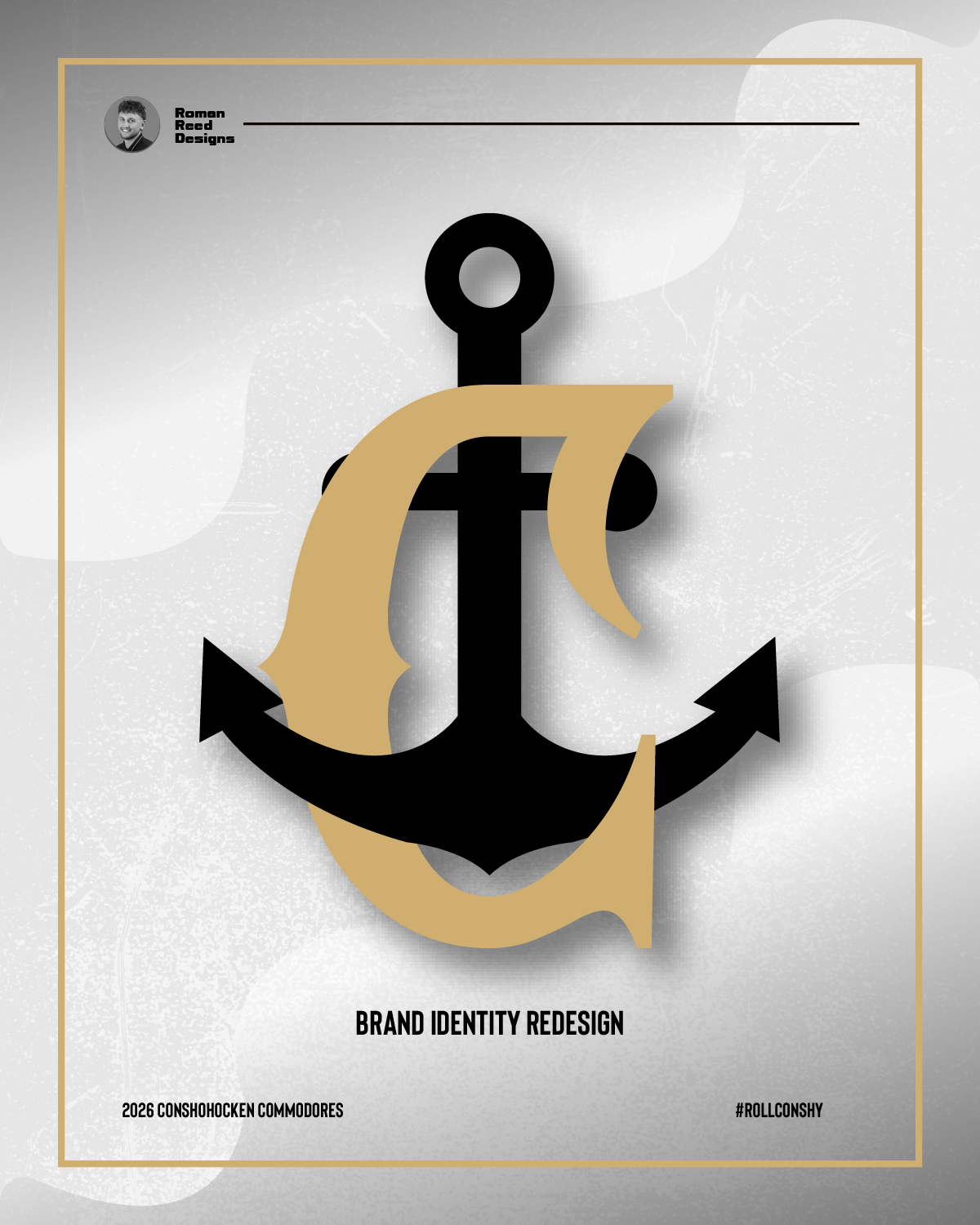
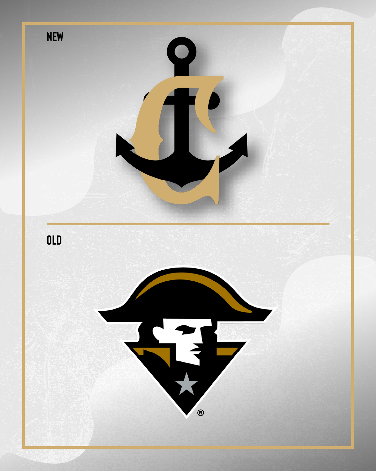
Conshohocken Commodores Logo/Brand Re-design
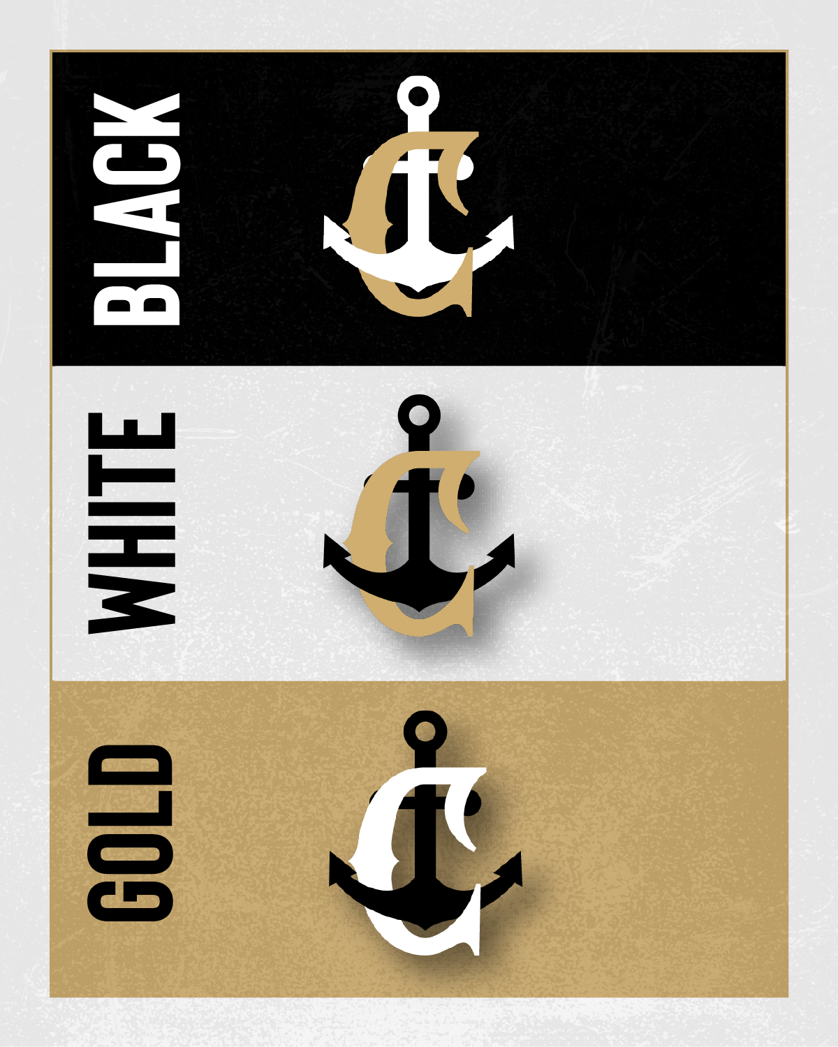
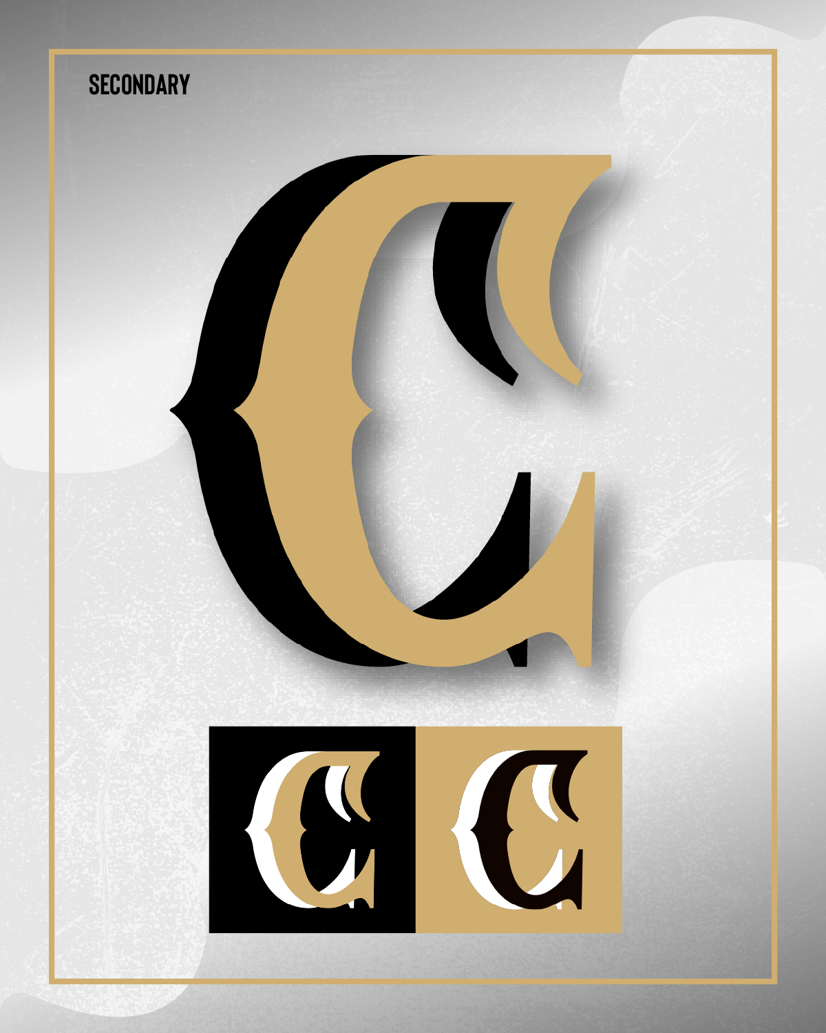
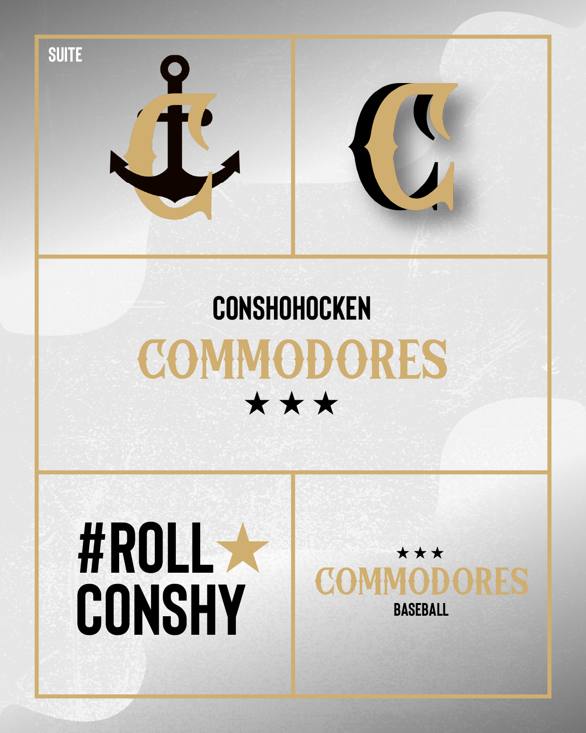
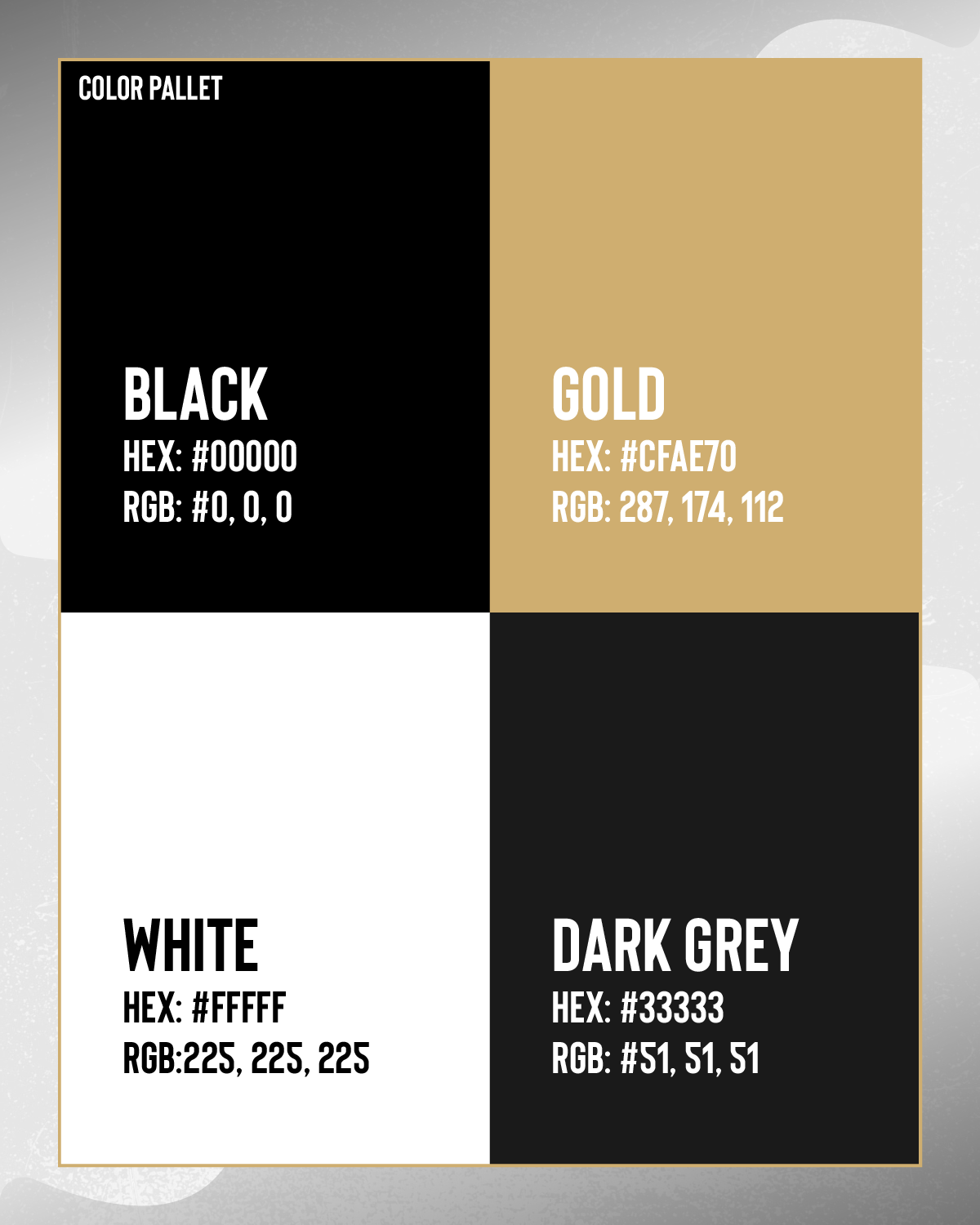
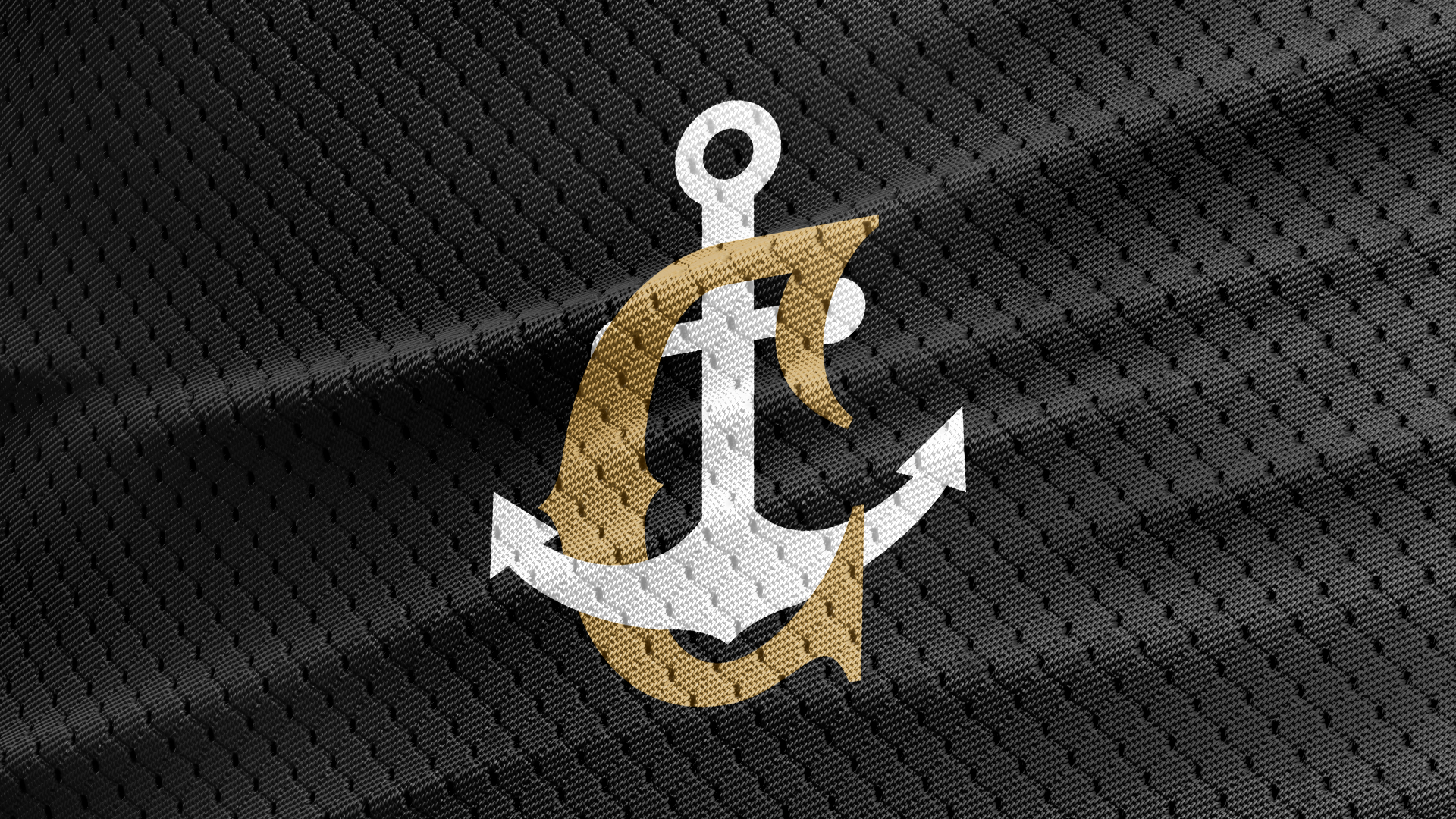
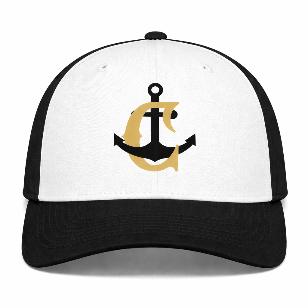
The Commodores’ new brand identity uses the anchor as a symbol of resilience and control through the grind of a baseball season. Paired with a “C” in Gokil Nova, the brand feels unified, nautical, and gritty. It’s designed to hold steady and compete at the highest level.
The Commodores’ new brand identity uses the anchor as a symbol of resilience and control through the grind of a baseball season. Paired with a “C” in Gokil Nova, the brand feels unified, nautical, and gritty. It’s designed to hold steady and compete at the highest level.
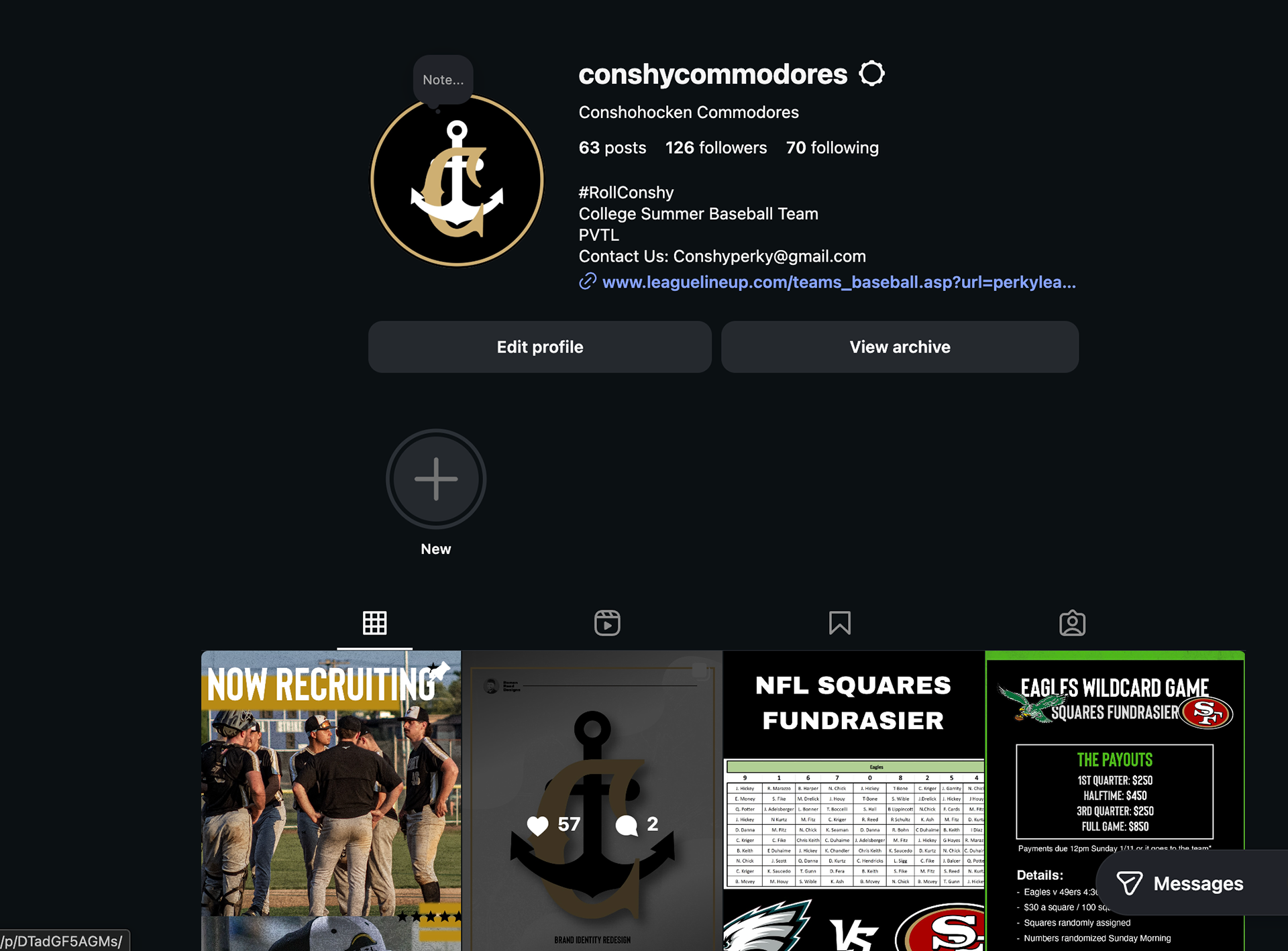
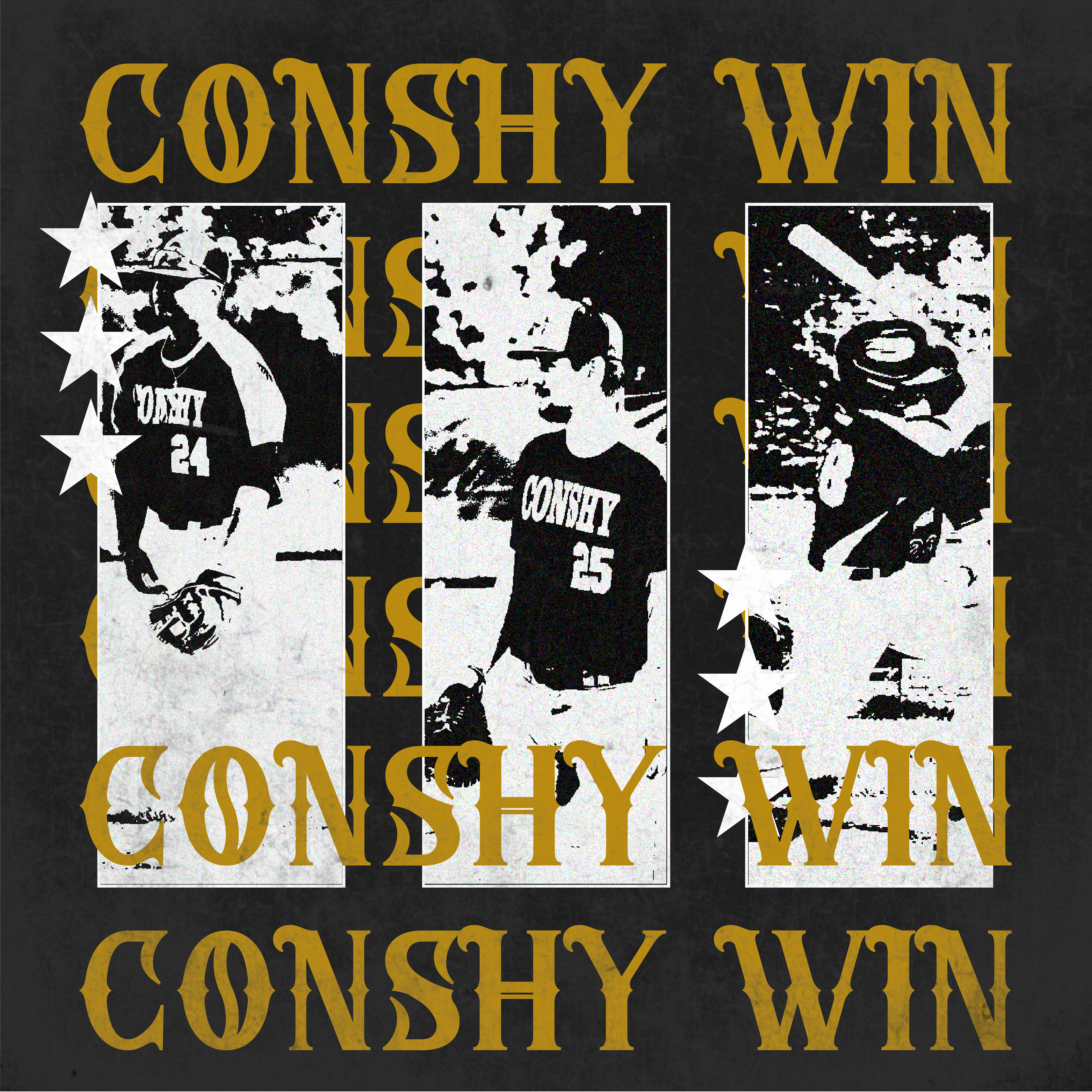
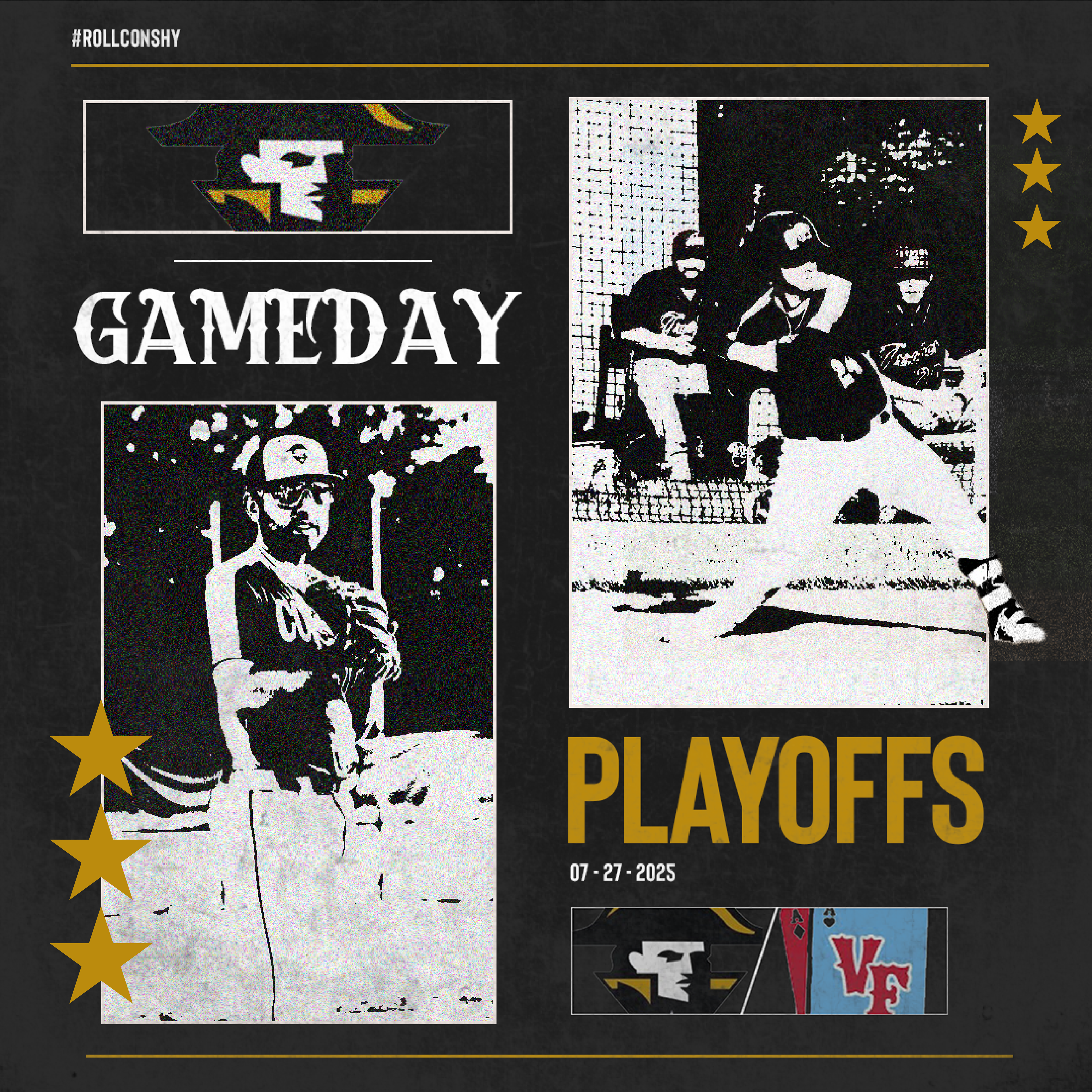
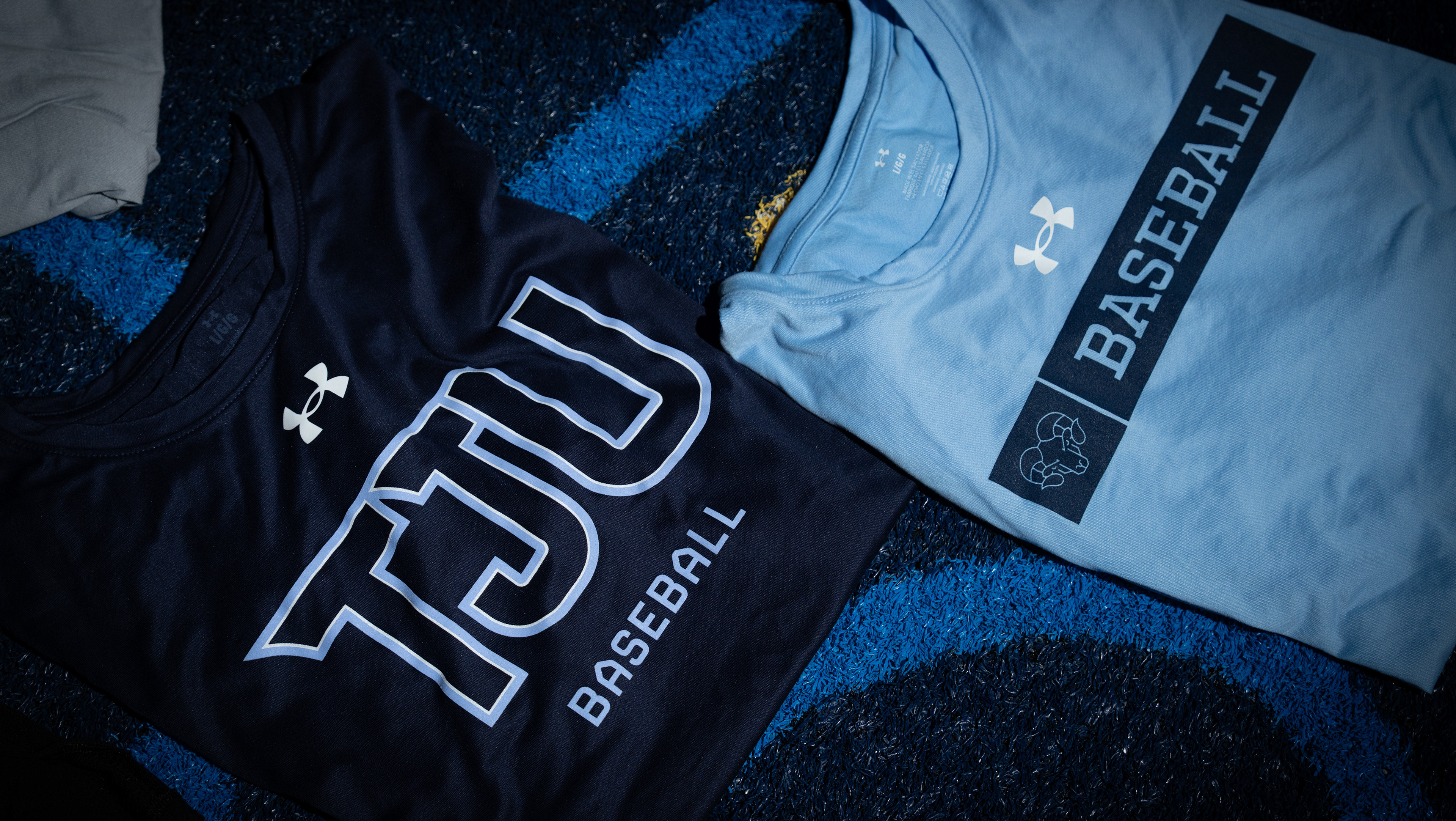
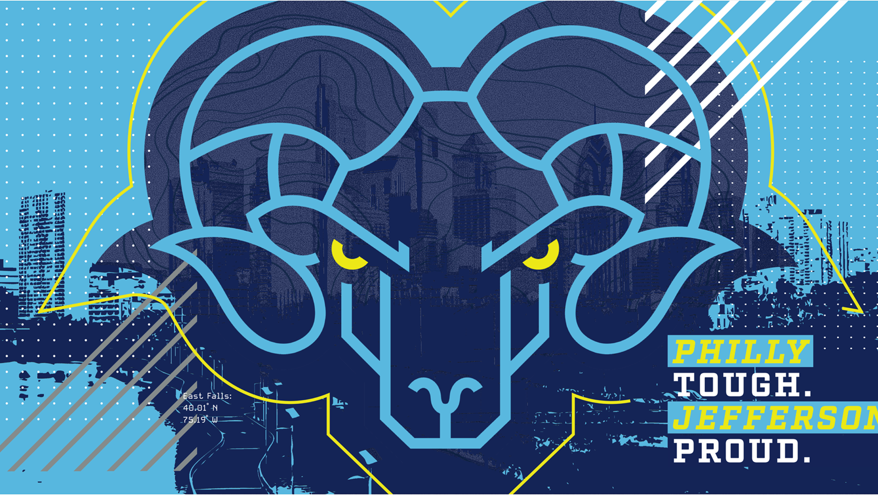
Social Media Posts